
An example of a Dashboard
In the beginning a little bit of background: we were helping to asset management department of an energy distribution company in Western Australia. They are managing a number of different assets like poles, wires, transformers, switches, fuses, etc. Their business requires measuring the following events: number of failures, number of electric shocks, ground fires and environmental incidents. After grouping assets into classes, the number of KPIs representing failures was around 40. It is a substantial amount for a human to analyse, as well as for a dashboard to display. After multiplying that number by the four mentioned above measures, we would get 160 numbers to display and for users to consume. The business also requires to be able to see detailed records for a particular number that doesn’t look correct.
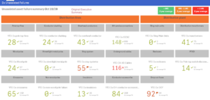
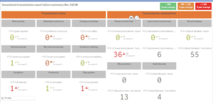
Originally, the department solved that challenge by creating two summary Qlik apps with the dashboards. Below you can see how the original dashboard looked like:
- Some numbers in different applications didn’t match each other. There was no functionality in the apps to help to investigate the problem.
- Half a day of focused work was required to refresh the data due to the complex application structure.
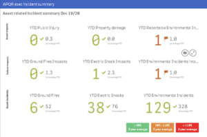
While solving main problems, the idea of network diagram appeared to be appropriate to resolve the issue with the dashboard overcrowded with KPIs.
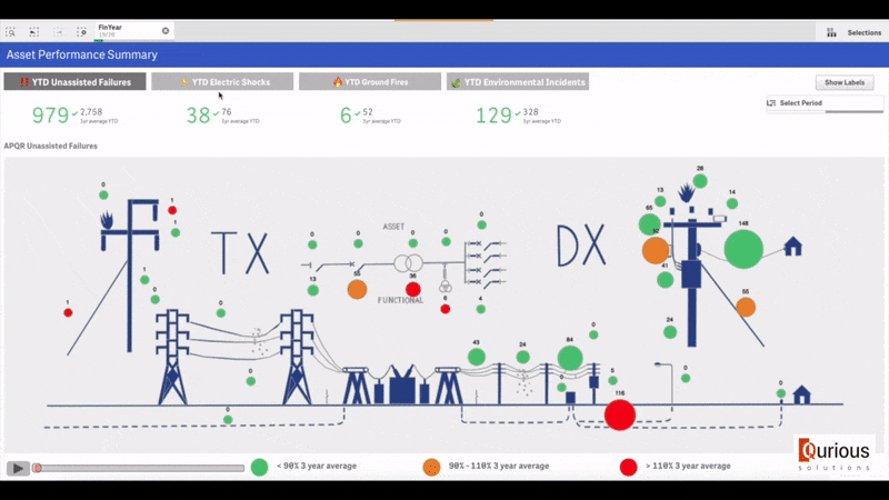
As you can see, we placed the high-level KPIs on the top with the possibility to flip the view between different measures by clicking the header.
We also made it possible to see additional charts without overcrowding the page: you just need to hover the mouse over a bubble to see the information.
As a result, just this one page became powerful enough to give all the required information in the vast majority of cases.
For the situations when more detailed information is required, we created Analysis and Details sheets which can be accessed by clicking on a correspondent KPI.
The result of our work was a one-stop-shop for all required information related to asset performance. As you can see, it is still possible in situations with highly diverse information. Sometimes, just the way you present the data helps to create a powerful analytic tool for the customer.
As for initial pain points, one application by its nature doesn’t suffer the problem of synchronisation with the other applications. The effort to refresh is just one mouse click away, and 10-15 minutes later, the user can get all the current information. The new approach also made it possible to see updated data at any time.
As for technologies, Qlik Sense and Qlik Geo Analytics helped us to deliver the project.
*The numbers and colours on the screenshots were changed in order to anonymise the customer